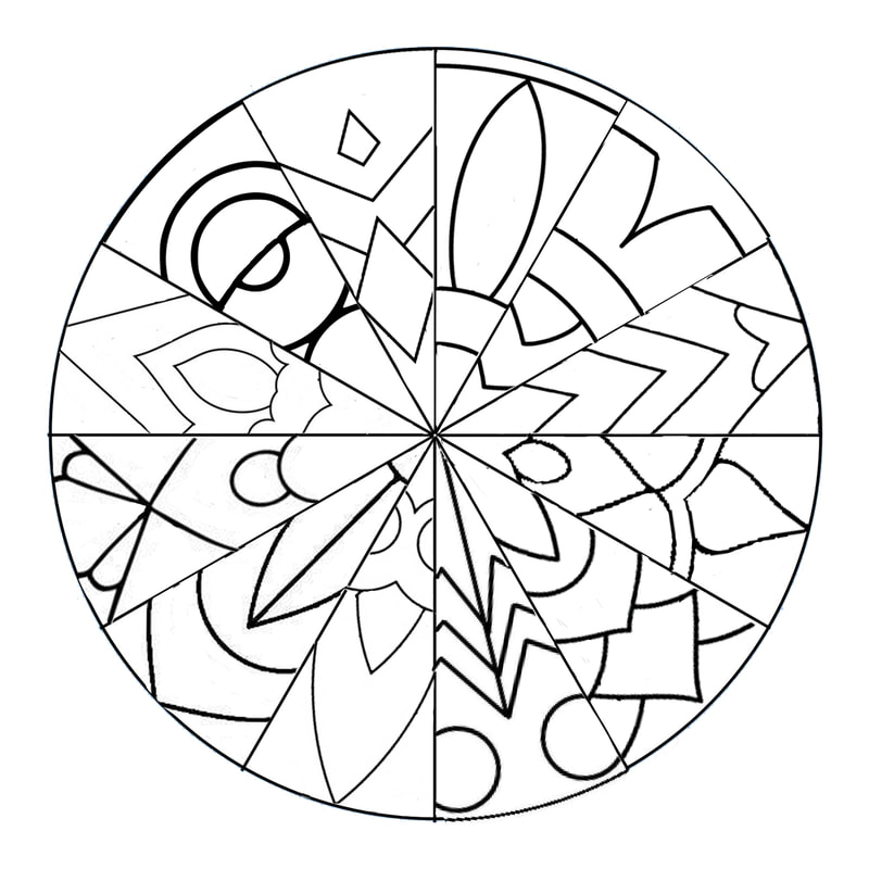
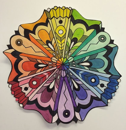
Color Harmonies
|
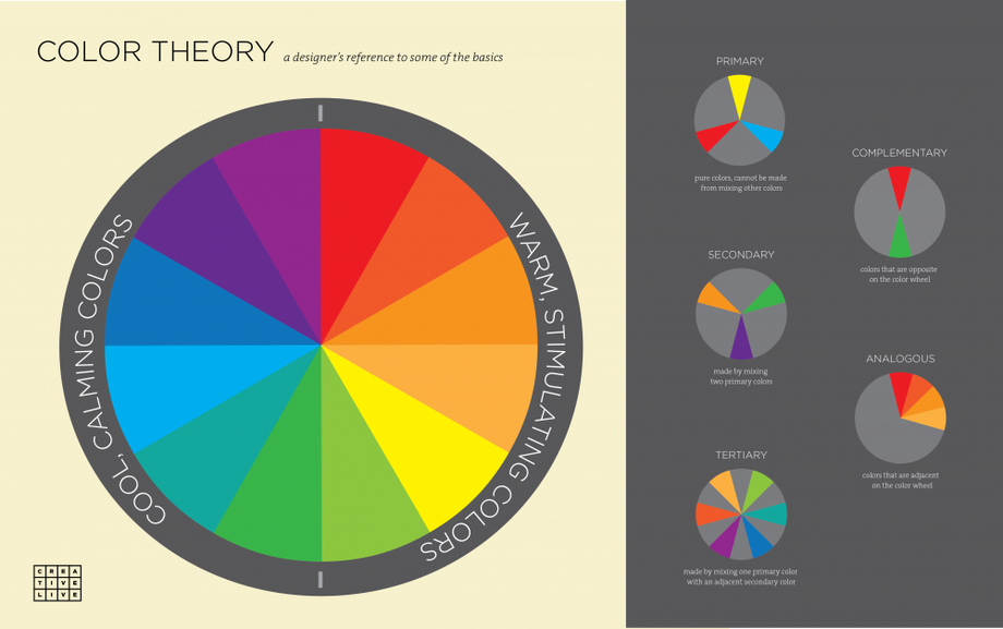
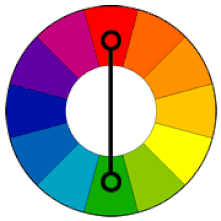
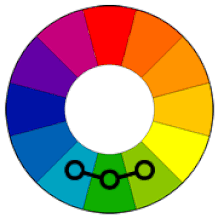
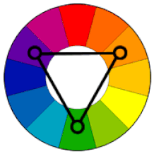
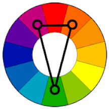
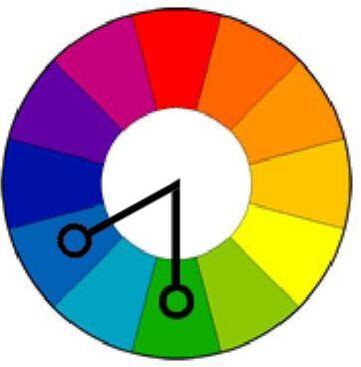
Complementary Colors that are opposite each other on the color wheel are considered to be complementary colors (example: red and green). The high contrast of complementary colors creates a vibrant look especially when used at full saturation. This color scheme must be managed well so it is not jarring. Analogous Analogous color schemes use colors that are next to each other on the color wheel. They usually match well and create serene and comfortable designs. Analogous color schemes are often found in nature and are harmonious and pleasing to the eye. Triadic A triadic color scheme uses colors that are evenly spaced around the color wheel. Triadic color schemes tend to be quite vibrant, even if you use pale or unsaturated versions of your hues. Split-Complementary The split-complementary color scheme is a variation of the complementary color scheme. In addition to the base color, it uses the two colors adjacent to its complement. This color scheme has the same strong visual contrast as the complementary color scheme, but has less tension. Diadic A diadic color scheme uses two colors that are close in proximity on the color wheel , but are not directly next to one another. Similar to analogous in that they produce a very cohesive scheme but have more contrast between the 2 colors |
|


|
|
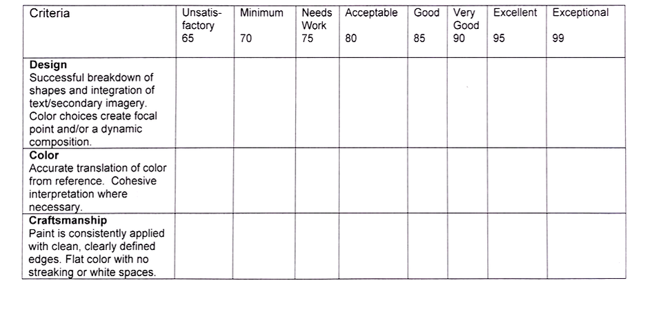
Grading Rubric
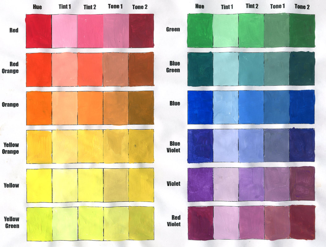
Value Scale
|
Color
Accurate color representation of tints and tones Consistency in value of tints and tones between each color scale |
Technique
Color is contained within and fills the entire rectangle Color is uniform throughout the shape Color is opaque, not streaky |
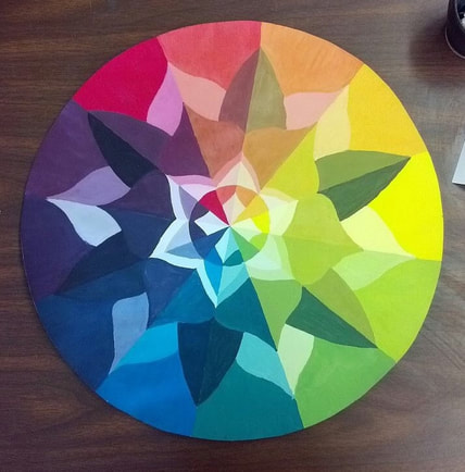
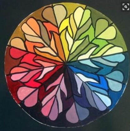
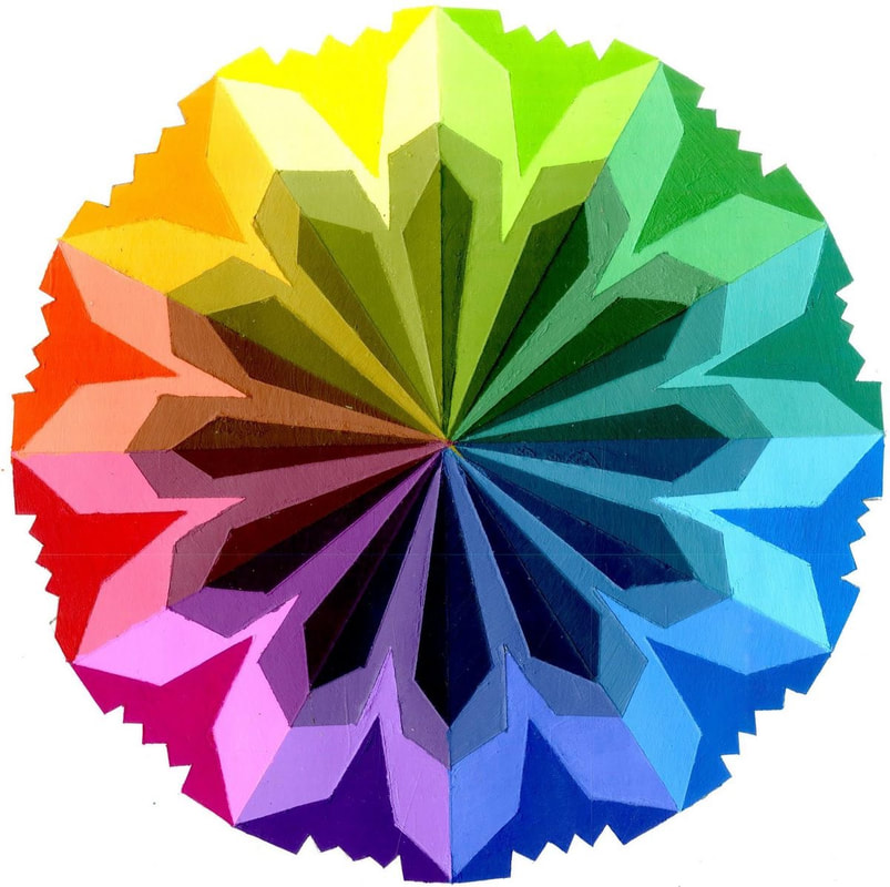
Color Wheel
|
Design
|
Color
|
Color Range
|
Technique
|
Hard-Edged Painting Rubric